pacman::p_load(spdep, tmap, sf, ClustGeo,
               ggpubr, cluster, factoextra, NbClust,
heatmaply, corrplot, psych, tidyverse, GGally, plotly, knitr)6A: Geographical Segmentation with Spatially Constrained Clustering Techniques
In this exercise, we will learn to delineate homogeneous regions using hierarchical and spatially constrained clustering techniques on geographically referenced multivariate data.
1 Exercise 6A Reference
2 Overview
In this exercise, we will learn to delineate homogeneous regions using hierarchical and spatially constrained clustering techniques on geographically referenced multivariate data.
3 Learning Outcome
- Convert GIS polygon data to R’s simple feature data frame.
- Convert simple feature data frame to R’s SpatialPolygonDataFrame object.
- Perform cluster analysis with hclust().
- Conduct spatially constrained cluster analysis using skater().
- Visualize analysis outputs using ggplot2 and tmap.
4 The Analytical Question
In geobusiness and spatial policy, delineating market or planning areas into homogeneous regions using multivariate data is a common approach.
In this exercise, we aim to divide Shan State, Myanmar into homogeneous regions based on various Information and Communication Technology (ICT) indicators, such as radio, television, landline phones, mobile phones, computers, and home internet access.
5 The Data
The following 2 datasets will be used in this study.
| Data Set | Description | Format |
|---|---|---|
| myanmar_township_boundaries | GIS data in ESRI shapefile format containing township boundary information of Myanmar, represented as polygon features. | ESRI Shapefile |
| Shan-ICT.csv | Extract of the 2014 Myanmar Population and Housing Census at the township level. | CSV |
Both datasets are downloaded from the Myanmar Information Management Unit (MIMU).
6 Installing and Launching the R Packages
To install and load these packages, use the following code:
7 Import Data and Preparation
7.1 Import Geospatial Shapefile
Firstly, we will use
st_read()
of sf package to import Myanmar Township Boundary
shapefile into R. The imported shapefile will be
simple features Object of sf.
shan_sf <- st_read(dsn = "data/geospatial", layer = "myanmar_township_boundaries")Reading layer `myanmar_township_boundaries' from data source
`/Users/walter/code/isss626/isss626-gaa/Hands-on_Ex/Hands-on_Ex06/data/geospatial'
using driver `ESRI Shapefile'
Simple feature collection with 330 features and 14 fields
Geometry type: MULTIPOLYGON
Dimension: XY
Bounding box: xmin: 92.17275 ymin: 9.671252 xmax: 101.1699 ymax: 28.54554
Geodetic CRS: WGS 84| OBJECTID | ST | ST_PCODE | DT | DT_PCODE | TS | TS_PCODE | ST_2 | LABEL2 | SELF_ADMIN | ST_RG | T_NAME_WIN | T_NAME_M3 | AREA | geometry |
|---|---|---|---|---|---|---|---|---|---|---|---|---|---|---|
| 250 | Kachin | MMR001 | Mohnyin | MMR001D002 | Hpakant | MMR001009 | Kachin State | Hpakant | ||||||
| 169795 | NA | State | zm;uefU | ဖားကန့် | 5761.2964 | MULTIPOLYGON (((96.15953 26… | ||||||||
| 163 | Shan (North) | MMR015 | Mongmit | MMR015D008 | Mongmit | MMR015017 | Shan State (North) | Mongmit | ||||||
| 61072 | NA | State | rdk;rdwf | မိုးမိတ် | 2703.6114 | MULTIPOLYGON (((96.96001 23… | ||||||||
| 96 | Bago (East) | MMR007 | Bago | MMR007D001 | Waw | MMR007004 | Bago Region (East) | Waw | ||||||
| 199032 | NA | Region | a0g | ဝေါ | 952.4398 | MULTIPOLYGON (((96.61505 17… | ||||||||
| 147 | Bago (West) | MMR008 | Pyay | MMR008D001 | Paukkhaung | MMR008002 | Bago Region (West) | Paukkhaung | ||||||
| 117164 | NA | Region | aygufacgif; | ပေါက်ခေါင်း | 1918.6734 | MULTIPOLYGON (((95.82708 19… | ||||||||
| 263 | Mandalay | MMR010 | Pyinoolwin | MMR010D002 | Mogoke | MMR010011 | Mandalay Region | Mogoke | ||||||
| 191775 | NA | Region | rdk;ukwf | မိုးကုတ် | 1178.5076 | MULTIPOLYGON (((96.22371 23… | ||||||||
| 167 | Kachin | MMR001 | Bhamo | MMR001D003 | Shwegu | MMR001011 | Kachin State | Shwegu | ||||||
| 84750 | NA | State | a&Tul | ရွှေကူ | 3088.8291 | MULTIPOLYGON (((96.68573 24… |
Since our study area is the Shan state, we will examine the state list in the dataframe for the relevant state names (keys) for filtering.
 [1] "Ayeyarwady"   "Bago (East)"  "Bago (West)"  "Chin"         "Kachin"
 [6] "Kayah"        "Kayin"        "Magway"       "Mandalay"     "Mon"
[11] "Nay Pyi Taw"  "Rakhine"      "Sagaing"      "Shan (East)"  "Shan (North)"
[16] "Shan (South)" "Tanintharyi"  "Yangon"
shan_sf <-
shan_sf %>%
filter(ST %in% c("Shan (East)", "Shan (North)", "Shan (South)")) %>%
select(c(2:7))
shan_sfSimple feature collection with 55 features and 6 fields
Geometry type: MULTIPOLYGON
Dimension: XY
Bounding box: xmin: 96.15107 ymin: 19.29932 xmax: 101.1699 ymax: 24.15907
Geodetic CRS: WGS 84
First 10 features:
ST ST_PCODE DT DT_PCODE TS TS_PCODE
1 Shan (North) MMR015 Mongmit MMR015D008 Mongmit MMR015017
2 Shan (South) MMR014 Taunggyi MMR014D001 Pindaya MMR014006
3 Shan (South) MMR014 Taunggyi MMR014D001 Ywangan MMR014007
4 Shan (South) MMR014 Taunggyi MMR014D001 Pinlaung MMR014009
5 Shan (North) MMR015 Mongmit MMR015D008 Mabein MMR015018
6 Shan (South) MMR014 Taunggyi MMR014D001 Kalaw MMR014005
7 Shan (South) MMR014 Taunggyi MMR014D001 Pekon MMR014010
8 Shan (South) MMR014 Taunggyi MMR014D001 Lawksawk MMR014008
9 Shan (North) MMR015 Kyaukme MMR015D003 Nawnghkio MMR015013
10 Shan (North) MMR015 Kyaukme MMR015D003 Kyaukme MMR015012
geometry
1 MULTIPOLYGON (((96.96001 23...
2 MULTIPOLYGON (((96.7731 21....
3 MULTIPOLYGON (((96.78483 21...
4 MULTIPOLYGON (((96.49518 20...
5 MULTIPOLYGON (((96.66306 24...
6 MULTIPOLYGON (((96.49518 20...
7 MULTIPOLYGON (((97.14738 19...
8 MULTIPOLYGON (((96.94981 22...
9 MULTIPOLYGON (((96.75648 22...
10 MULTIPOLYGON (((96.95498 22...Then, we filter the dataframe to contain only the Shan states.
7.2 Import Aspatial csv File
Next, we will import Shan-ICT.csv into R by using
read_csv() of readr package. The
output is R dataframe class.
ict <- read_csv ("data/aspatial/Shan-ICT.csv")summary(ict) District Pcode District Name Township Pcode Township Name
Length:55 Length:55 Length:55 Length:55
Class :character Class :character Class :character Class :character
Mode :character Mode :character Mode :character Mode :character
Total households Radio Television Land line phone
Min. : 3318 Min. : 115 Min. : 728 Min. : 20.0
1st Qu.: 8711 1st Qu.: 1260 1st Qu.: 3744 1st Qu.: 266.5
Median :13685 Median : 2497 Median : 6117 Median : 695.0
Mean :18369 Mean : 4487 Mean :10183 Mean : 929.9
3rd Qu.:23471 3rd Qu.: 6192 3rd Qu.:13906 3rd Qu.:1082.5
Max. :82604 Max. :30176 Max. :62388 Max. :6736.0
Mobile phone Computer Internet at home
Min. : 150 Min. : 20.0 Min. : 8.0
1st Qu.: 2037 1st Qu.: 121.0 1st Qu.: 88.0
Median : 3559 Median : 244.0 Median : 316.0
Mean : 6470 Mean : 575.5 Mean : 760.2
3rd Qu.: 7177 3rd Qu.: 507.0 3rd Qu.: 630.5
Max. :48461 Max. :6705.0 Max. :9746.0 There are a total of 11 fields and 55 observation in the dataframe.
7.3 Deriving New Variables Using the dplyr Package
The values in the dataset represent the number of households, which can be biased by the total number of households in each township. Townships with more households will naturally have higher numbers of households owning items like radios or TVs.
To address this bias, we will calculate the penetration rate for each ICT variable by dividing the number of households owning each item by the total number of households, then multiplying by 1000. This will normalize the data, allowing for a fair comparison between townships. Here is the code to perform this calculation:
ict_derived <- ict %>%
  # feature engineering: normalize data
  mutate(
    RADIO_PR = Radio / `Total households` * 1000,
    TV_PR = Television / `Total households` * 1000,
    LLPHONE_PR = `Land line phone` / `Total households` * 1000,
    MPHONE_PR = `Mobile phone` / `Total households` * 1000,
    COMPUTER_PR = Computer / `Total households` * 1000,
    INTERNET_PR = `Internet at home` / `Total households` * 1000
  ) %>%
  # improve readability of col names
  rename(
    DT_PCODE = `District Pcode`, DT = `District Name`,
    TS_PCODE = `Township Pcode`, TS = `Township Name`,
    TT_HOUSEHOLDS = `Total households`,
    RADIO = Radio, TV = Television,
    LLPHONE = `Land line phone`, MPHONE = `Mobile phone`,
    COMPUTER = Computer, INTERNET = `Internet at home`
  )
We can then review the summary statistics of the newly derived penetration rates using:
summary(ict_derived) DT_PCODE DT TS_PCODE TS
Length:55 Length:55 Length:55 Length:55
Class :character Class :character Class :character Class :character
Mode :character Mode :character Mode :character Mode :character
TT_HOUSEHOLDS RADIO TV LLPHONE
Min. : 3318 Min. : 115 Min. : 728 Min. : 20.0
1st Qu.: 8711 1st Qu.: 1260 1st Qu.: 3744 1st Qu.: 266.5
Median :13685 Median : 2497 Median : 6117 Median : 695.0
Mean :18369 Mean : 4487 Mean :10183 Mean : 929.9
3rd Qu.:23471 3rd Qu.: 6192 3rd Qu.:13906 3rd Qu.:1082.5
Max. :82604 Max. :30176 Max. :62388 Max. :6736.0
MPHONE COMPUTER INTERNET RADIO_PR
Min. : 150 Min. : 20.0 Min. : 8.0 Min. : 21.05
1st Qu.: 2037 1st Qu.: 121.0 1st Qu.: 88.0 1st Qu.:138.95
Median : 3559 Median : 244.0 Median : 316.0 Median :210.95
Mean : 6470 Mean : 575.5 Mean : 760.2 Mean :215.68
3rd Qu.: 7177 3rd Qu.: 507.0 3rd Qu.: 630.5 3rd Qu.:268.07
Max. :48461 Max. :6705.0 Max. :9746.0 Max. :484.52
TV_PR LLPHONE_PR MPHONE_PR COMPUTER_PR
Min. :116.0 Min. : 2.78 Min. : 36.42 Min. : 3.278
1st Qu.:450.2 1st Qu.: 22.84 1st Qu.:190.14 1st Qu.:11.832
Median :517.2 Median : 37.59 Median :305.27 Median :18.970
Mean :509.5 Mean : 51.09 Mean :314.05 Mean :24.393
3rd Qu.:606.4 3rd Qu.: 69.72 3rd Qu.:428.43 3rd Qu.:29.897
Max. :842.5 Max. :181.49 Max. :735.43 Max. :92.402
INTERNET_PR
Min. : 1.041
1st Qu.: 8.617
Median : 22.829
Mean : 30.644
3rd Qu.: 41.281
Max. :117.985
This process adds six new fields to the data frame:
RADIO_PR, TV_PR,
LLPHONE_PR, MPHONE_PR,
COMPUTER_PR, and INTERNET_PR,
representing the penetration rates for each ICT variable.
8 Exploratory Data Analysis (EDA)
8.1 Statistical Graphics
Histogram is useful to identify the overall distribution of the data values (i.e. left skew, right skew or normal distribution)
p <- ggplot(data = ict_derived, aes(x = RADIO)) +
  geom_histogram(bins = 20, color = "black", fill = "lightblue") +
  labs(
    title = "Distribution of Radio Ownership",
    x = "Number of Households with Radio",
    y = "Frequency"
  ) +
  theme_minimal()

ggplotly(p)
Boxplot is useful to detect if there are outliers.
plot_ly(data = ict_derived,
        x = ~RADIO,
        type = 'box',
        fillcolor = 'lightblue',
        marker = list(color = 'lightblue'),
        notched = TRUE
       ) %>%
  layout(
    title = "Distribution of Radio Ownership",
    xaxis = list(title = "Number of Households with Radio")
  )
We will also plotting the distribution of the newly derived variables (i.e. Radio penetration rate).
Show the code
mean_pr <- round(mean(ict_derived$`RADIO_PR`, na.rm = TRUE), 1)

# Define common axis properties
axis_settings <- list(
  title = "",
  zeroline = FALSE,
  showline = FALSE,
  showgrid = FALSE
)

aax_b <- list(
  title = "",
  zeroline = FALSE,
  showline = FALSE,
  showticklabels = FALSE,
  showgrid = FALSE
)

# Plot Histogram
histogram_plot <- plot_ly(
  ict_derived,
  x = ~`RADIO_PR`,
  type = 'histogram',
  histnorm = "count",
  marker = list(color = 'lightblue'),
  hovertemplate = 'Radio Penetration Rate: %{x}<br>Frequency: %{y}<extra></extra>'
) %>%
  add_lines(
    x = mean_pr, y = c(0, 15),
    line = list(width = 3, color = "black"),
    showlegend = FALSE
  ) %>%
  add_annotations(
    text = paste("Mean: ", mean_pr),
    x = mean_pr, y = 15,
    showarrow = FALSE,
    font = list(size = 12)
  ) %>%
  layout(
    xaxis = list(title = "Radio Penetration Rate"),
    yaxis = axis_settings,
    bargap = 0.1
  )

# Plot Boxplot
boxplot_plot <- plot_ly(
  ict_derived,
  x = ~`RADIO_PR`,
  type = "box",
  boxpoints = "all",
  jitter = 0.3,
  pointpos = -1.8,
  notched = TRUE,
  fillcolor = 'lightblue',
  marker = list(color = 'lightblue'),
  showlegend = FALSE
) %>%
  layout(
    xaxis = axis_settings,
    yaxis = aax_b
  )

# Combine Histogram and Boxplot
subplot(
  boxplot_plot, histogram_plot,
  nrows = 2, heights = c(0.2, 0.8), shareX = TRUE
) %>%
  layout(
    showlegend = FALSE,
    title = "Distribution of Radio Penetration Rate",
    xaxis = list(range = c(0, 500))
  )
Note
When we compare the distribution of radio ownership vs radio penetration rate, the distribution of radio penetration rate is less skewed.
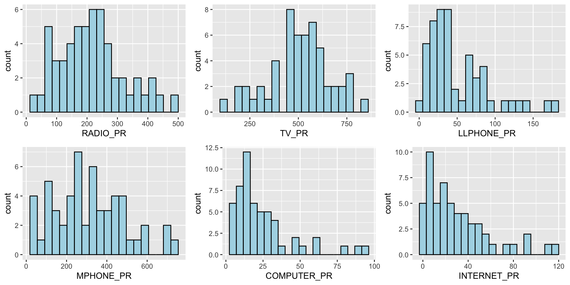
We can also plot multiple histograms to get a sense of the feature engineered fields.
Show the code
radio <- ggplot(data=ict_derived,
             aes(x= `RADIO_PR`)) +
  geom_histogram(bins=20,
                 color="black",
                 fill="light blue")

tv <- ggplot(data=ict_derived,
             aes(x= `TV_PR`)) +
  geom_histogram(bins=20,
                 color="black",
                 fill="light blue")

llphone <- ggplot(data=ict_derived,
             aes(x= `LLPHONE_PR`)) +
  geom_histogram(bins=20,
                 color="black",
                 fill="light blue")

mphone <- ggplot(data=ict_derived,
             aes(x= `MPHONE_PR`)) +
  geom_histogram(bins=20,
                 color="black",
                 fill="light blue")

computer <- ggplot(data=ict_derived,
             aes(x= `COMPUTER_PR`)) +
  geom_histogram(bins=20,
                 color="black",
                 fill="light blue")

internet <- ggplot(data=ict_derived,
             aes(x= `INTERNET_PR`)) +
  geom_histogram(bins=20,
                 color="black",
                 fill="light blue")

ggarrange(radio, tv, llphone, mphone, computer, internet, ncol = 3, nrow = 2)
8.2 EDA using Choropleth Map
8.2.1 Joining Geospatial Data with Aspatial Data
Before we can prepare the choropleth map, we need to combine both the geospatial data object (i.e. shan_sf) and aspatial data.frame object (i.e. ict_derived) into one. This will be performed by using the left_join function of dplyr package. The shan_sf simple feature data.frame will be used as the base data object and the ict_derived data.frame will be used as the join table.
To join the data objects, we use the unique identifier,
TS_PCODE.
file_path <- "data/rds/shan_sf.rds"

if (!file.exists(file_path)) {
  shan_sf <- left_join(shan_sf, ict_derived, by = c("TS_PCODE" = "TS_PCODE"))
  write_rds(shan_sf, file_path)

} else {
  shan_sf <- read_rds(file_path)
}

kable(head(shan_sf))| ST | ST_PCODE | DT.x | DT_PCODE.x | TS.x | TS_PCODE | DT_PCODE.y | DT.y | TS.y | TT_HOUSEHOLDS.x | RADIO.x | TV.x | LLPHONE.x | MPHONE.x | COMPUTER.x | INTERNET.x | RADIO_PR.x | TV_PR.x | LLPHONE_PR.x | MPHONE_PR.x | COMPUTER_PR.x | INTERNET_PR.x | DT_PCODE.x.x | DT.x.x | TS.x.x | TT_HOUSEHOLDS.y | RADIO.y | TV.y | LLPHONE.y | MPHONE.y | COMPUTER.y | INTERNET.y | RADIO_PR.y | TV_PR.y | LLPHONE_PR.y | MPHONE_PR.y | COMPUTER_PR.y | INTERNET_PR.y | DT_PCODE.y.y | DT.y.y | TS.y.y | TT_HOUSEHOLDS | RADIO | TV | LLPHONE | MPHONE | COMPUTER | INTERNET | RADIO_PR | TV_PR | LLPHONE_PR | MPHONE_PR | COMPUTER_PR | INTERNET_PR | geometry |
|---|---|---|---|---|---|---|---|---|---|---|---|---|---|---|---|---|---|---|---|---|---|---|---|---|---|---|---|---|---|---|---|---|---|---|---|---|---|---|---|---|---|---|---|---|---|---|---|---|---|---|---|---|---|---|
| Shan (North) | MMR015 | Mongmit | MMR015D008 | Mongmit | MMR015017 | MMR015D003 | Kyaukme | Mongmit | 13652 | 3907 | 7565 | 482 | 3559 | 166 | 321 | 286.1852 | 554.1313 | 35.30618 | 260.6944 | 12.15939 | 23.513038 | MMR015D003 | Kyaukme | Mongmit | 13652 | 3907 | 7565 | 482 | 3559 | 166 | 321 | 286.1852 | 554.1313 | 35.30618 | 260.6944 | 12.15939 | 23.513038 | MMR015D003 | Kyaukme | Mongmit | 13652 | 3907 | 7565 | 482 | 3559 | 166 | 321 | 286.1852 | 554.1313 | 35.30618 | 260.6944 | 12.15939 | 23.513038 | MULTIPOLYGON (((96.96001 23… |
| Shan (South) | MMR014 | Taunggyi | MMR014D001 | Pindaya | MMR014006 | MMR014D001 | Taunggyi | Pindaya | 17544 | 7324 | 8862 | 348 | 2849 | 226 | 136 | 417.4647 | 505.1300 | 19.83584 | 162.3917 | 12.88190 | 7.751938 | MMR014D001 | Taunggyi | Pindaya | 17544 | 7324 | 8862 | 348 | 2849 | 226 | 136 | 417.4647 | 505.1300 | 19.83584 | 162.3917 | 12.88190 | 7.751938 | MMR014D001 | Taunggyi | Pindaya | 17544 | 7324 | 8862 | 348 | 2849 | 226 | 136 | 417.4647 | 505.1300 | 19.83584 | 162.3917 | 12.88190 | 7.751938 | MULTIPOLYGON (((96.7731 21…. |
| Shan (South) | MMR014 | Taunggyi | MMR014D001 | Ywangan | MMR014007 | MMR014D001 | Taunggyi | Ywangan | 18348 | 8890 | 4781 | 219 | 2207 | 81 | 152 | 484.5215 | 260.5734 | 11.93591 | 120.2856 | 4.41465 | 8.284282 | MMR014D001 | Taunggyi | Ywangan | 18348 | 8890 | 4781 | 219 | 2207 | 81 | 152 | 484.5215 | 260.5734 | 11.93591 | 120.2856 | 4.41465 | 8.284282 | MMR014D001 | Taunggyi | Ywangan | 18348 | 8890 | 4781 | 219 | 2207 | 81 | 152 | 484.5215 | 260.5734 | 11.93591 | 120.2856 | 4.41465 | 8.284282 | MULTIPOLYGON (((96.78483 21… |
| Shan (South) | MMR014 | Taunggyi | MMR014D001 | Pinlaung | MMR014009 | MMR014D001 | Taunggyi | Pinlaung | 25504 | 5908 | 13816 | 728 | 6363 | 351 | 737 | 231.6499 | 541.7189 | 28.54454 | 249.4903 | 13.76255 | 28.897428 | MMR014D001 | Taunggyi | Pinlaung | 25504 | 5908 | 13816 | 728 | 6363 | 351 | 737 | 231.6499 | 541.7189 | 28.54454 | 249.4903 | 13.76255 | 28.897428 | MMR014D001 | Taunggyi | Pinlaung | 25504 | 5908 | 13816 | 728 | 6363 | 351 | 737 | 231.6499 | 541.7189 | 28.54454 | 249.4903 | 13.76255 | 28.897428 | MULTIPOLYGON (((96.49518 20… |
| Shan (North) | MMR015 | Mongmit | MMR015D008 | Mabein | MMR015018 | MMR015D003 | Kyaukme | Mabein | 8632 | 3880 | 6117 | 628 | 3389 | 142 | 165 | 449.4903 | 708.6423 | 72.75255 | 392.6089 | 16.45042 | 19.114921 | MMR015D003 | Kyaukme | Mabein | 8632 | 3880 | 6117 | 628 | 3389 | 142 | 165 | 449.4903 | 708.6423 | 72.75255 | 392.6089 | 16.45042 | 19.114921 | MMR015D003 | Kyaukme | Mabein | 8632 | 3880 | 6117 | 628 | 3389 | 142 | 165 | 449.4903 | 708.6423 | 72.75255 | 392.6089 | 16.45042 | 19.114921 | MULTIPOLYGON (((96.66306 24… |
| Shan (South) | MMR014 | Taunggyi | MMR014D001 | Kalaw | MMR014005 | MMR014D001 | Taunggyi | Kalaw | 41341 | 11607 | 25285 | 1739 | 16900 | 1225 | 1741 | 280.7624 | 611.6204 | 42.06478 | 408.7951 | 29.63160 | 42.113156 | MMR014D001 | Taunggyi | Kalaw | 41341 | 11607 | 25285 | 1739 | 16900 | 1225 | 1741 | 280.7624 | 611.6204 | 42.06478 | 408.7951 | 29.63160 | 42.113156 | MMR014D001 | Taunggyi | Kalaw | 41341 | 11607 | 25285 | 1739 | 16900 | 1225 | 1741 | 280.7624 | 611.6204 | 42.06478 | 408.7951 | 29.63160 | 42.113156 | MULTIPOLYGON (((96.49518 20… |
8.2.2 Preparing a Choropleth Map
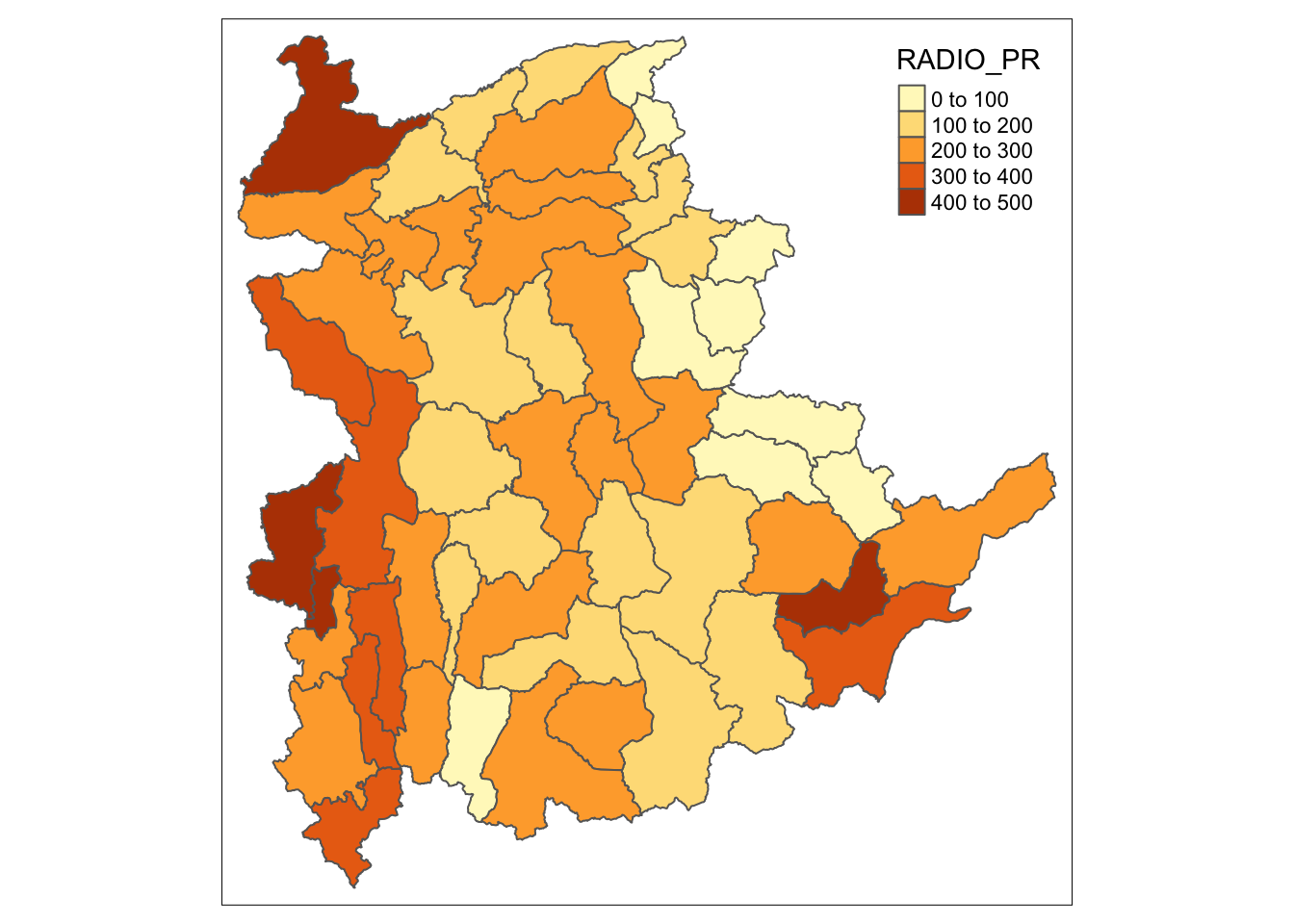
To have a quick look at the distribution of Radio penetration rate of Shan State at township level, a choropleth map will be prepared.
The code below is used to prepare the choropleth map by using the qtm() function of tmap package.
qtm(shan_sf, "RADIO_PR")
In order to reveal the distribution shown in the choropleth map above are bias to the underlying total number of households at the townships, we will create two choropleth maps, one for the total number of households (i.e. TT_HOUSEHOLDS.map) and one for the total number of household with Radio (RADIO.map) by using the code below.
TT_HOUSEHOLDS.map <- tm_shape(shan_sf) +
  tm_fill(col = "TT_HOUSEHOLDS",
          n = 5,
          style = "jenks",
          title = "Total households") +
  tm_borders(alpha = 0.5)

RADIO.map <- tm_shape(shan_sf) +
  tm_fill(col = "RADIO",
          n = 5,
          style = "jenks",
          title = "Number Radio ") +
  tm_borders(alpha = 0.5)

tmap_arrange(TT_HOUSEHOLDS.map, RADIO.map,
             asp=NA, ncol=2)
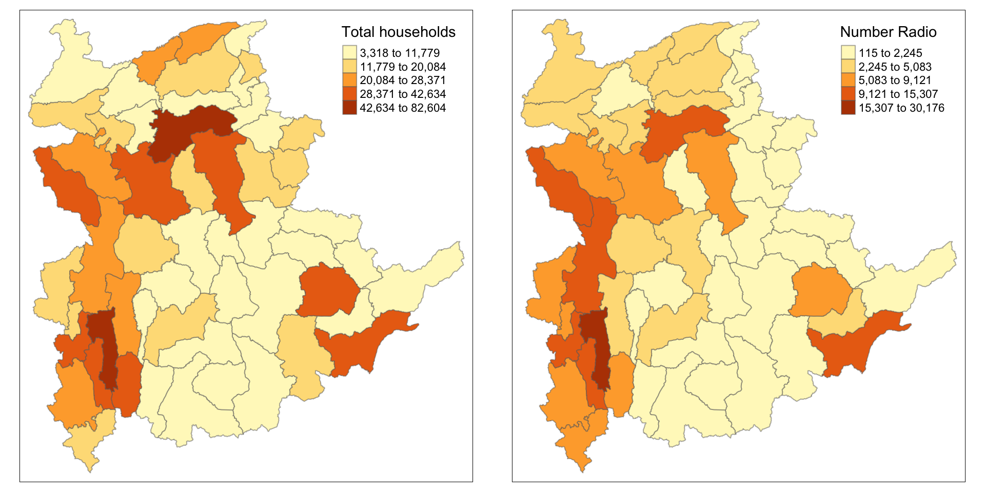
Notice that the choropleth maps above clearly show that townships with relatively larger number ot households are also showing relatively higher number of radio ownership.
Now let us plot the choropleth maps showing the distribution of total number of households and Radio penetration rate by using the code below.
tm_shape(shan_sf) +
    tm_polygons(c("TT_HOUSEHOLDS", "RADIO_PR"),
                style="jenks") +
    tm_facets(sync = TRUE, ncol = 2) +
  tm_legend(legend.position = c("right", "bottom"))+
  tm_layout(outer.margins=0, asp=0)
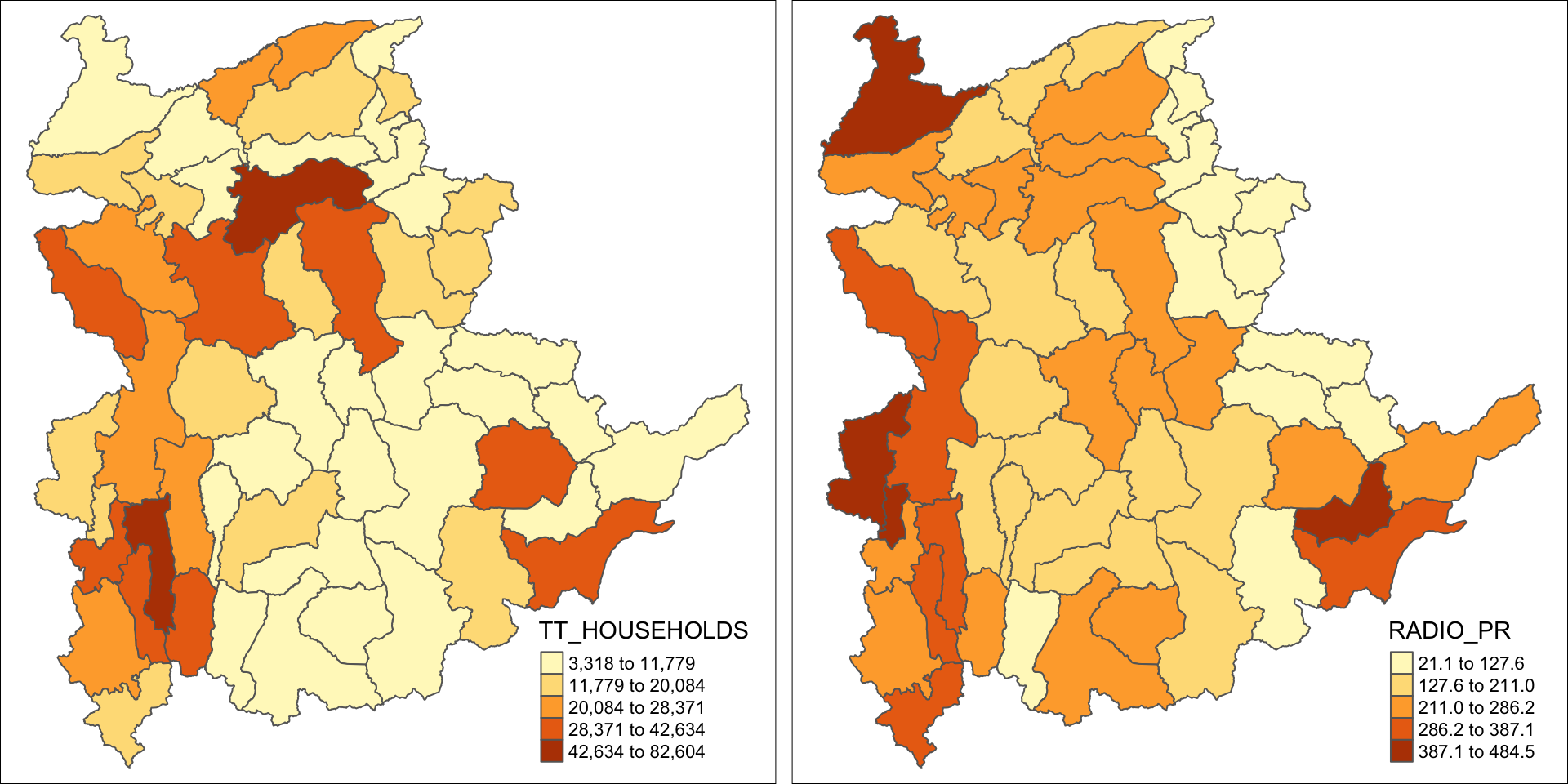
Note
At first glance, for the Distribution of total number of households and radios plot, it reveals that township with relative larger number of households also exhibit relatively higher number of radio ownership.
The penetration rate plot provides more nuanced insight into radio ownership, highlighting regions where radios are more common among households, regardless of the total number of households in the region. This may suggest radio ownership rate is no sole dependent on the total population but also on socio-economic factors, or policies etc.
9 Correlation Analysis
Before we perform cluster analysis, it is important for us to ensure that the cluster variables are not highly correlated.
In this section, we will use corrplot.mixed() function of corrplot package to visualise and analyse the correlation of the input variables.
cluster_vars.cor = cor(ict_derived[,12:17])
corrplot.mixed(cluster_vars.cor,
         lower = "ellipse",
               upper = "number",
               tl.pos = "lt",
               diag = "l",
               tl.col = "black")
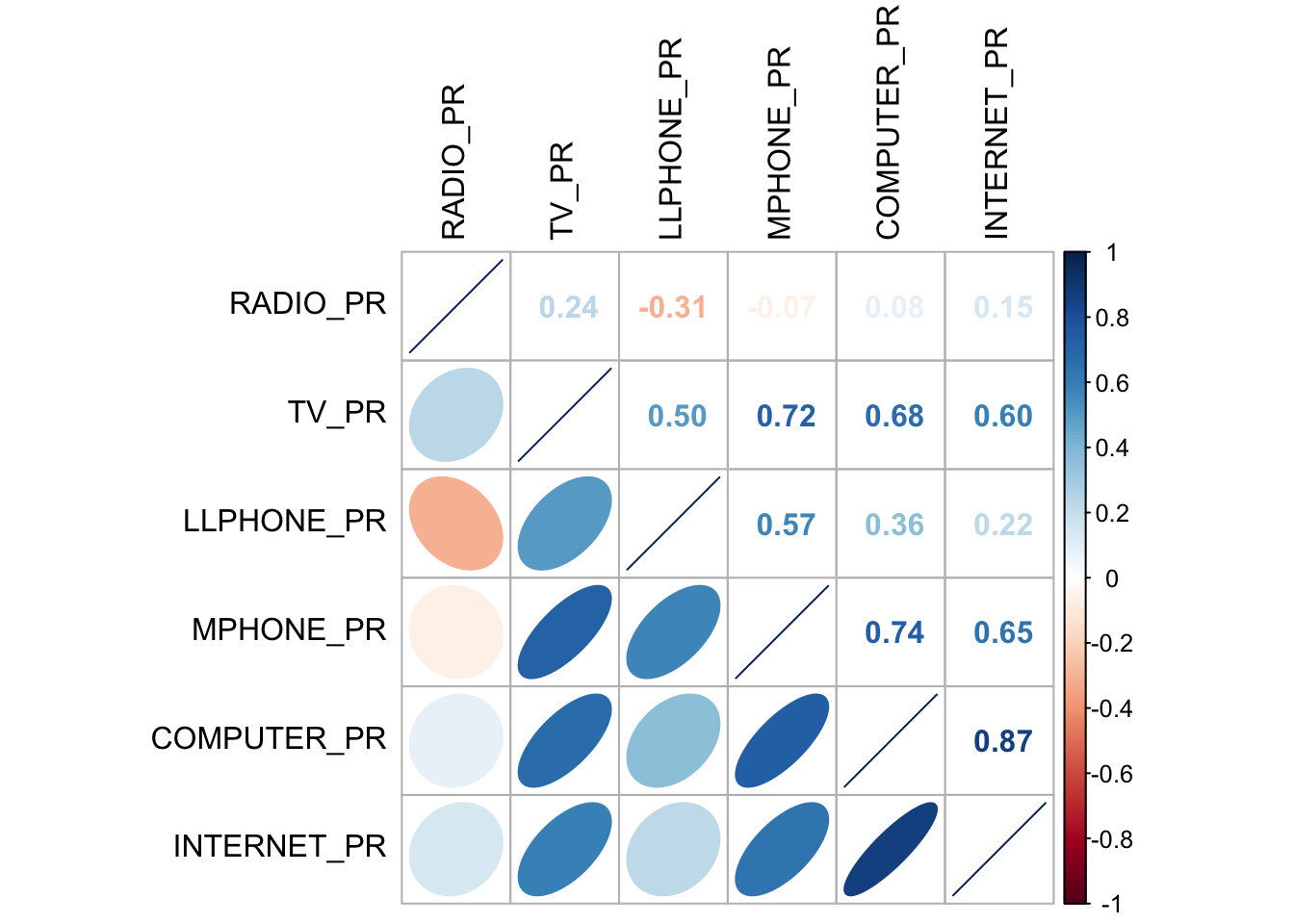
The correlation plot above shows that COMPUTER_PR and INTERNET_PR are highly correlated. This suggest that only one of them should be used in the cluster analysis instead of both.
10 Hierarchy Cluster Analysis
In this section, we will perform hierarchical cluster analysis.
10.1 Extracting Clustering Variables
The code below will be used to extract the clustering variables from the shan_sf simple feature object into data.frame.
cluster_vars <- shan_sf %>%
  st_set_geometry(NULL) %>%
  # we dont select INTERNET_PR
  select("TS.x", "RADIO_PR", "TV_PR", "LLPHONE_PR", "MPHONE_PR", "COMPUTER_PR")
head(cluster_vars,10)
TS.x RADIO_PR TV_PR LLPHONE_PR MPHONE_PR COMPUTER_PR
1 Mongmit 286.1852 554.1313 35.30618 260.6944 12.15939
2 Pindaya 417.4647 505.1300 19.83584 162.3917 12.88190
3 Ywangan 484.5215 260.5734 11.93591 120.2856 4.41465
4 Pinlaung 231.6499 541.7189 28.54454 249.4903 13.76255
5 Mabein 449.4903 708.6423 72.75255 392.6089 16.45042
6 Kalaw 280.7624 611.6204 42.06478 408.7951 29.63160
7 Pekon 318.6118 535.8494 39.83270 214.8476 18.97032
8 Lawksawk 387.1017 630.0035 31.51366 320.5686 21.76677
9 Nawnghkio 349.3359 547.9456 38.44960 323.0201 15.76465
10 Kyaukme 210.9548 601.1773 39.58267 372.4930 30.94709Notice that the final clustering variables list does not include variable INTERNET_PR because it is highly correlated with variable COMPUTER_PR.
Next, we need to change the rows by township name instead of row number by using the code below.
               TS.x RADIO_PR    TV_PR LLPHONE_PR MPHONE_PR COMPUTER_PR
Mongmit     Mongmit 286.1852 554.1313   35.30618  260.6944    12.15939
Pindaya     Pindaya 417.4647 505.1300   19.83584  162.3917    12.88190
Ywangan     Ywangan 484.5215 260.5734   11.93591  120.2856     4.41465
Pinlaung   Pinlaung 231.6499 541.7189   28.54454  249.4903    13.76255
Mabein       Mabein 449.4903 708.6423   72.75255  392.6089    16.45042
Kalaw         Kalaw 280.7624 611.6204   42.06478  408.7951    29.63160
Pekon         Pekon 318.6118 535.8494   39.83270  214.8476    18.97032
Lawksawk   Lawksawk 387.1017 630.0035   31.51366  320.5686    21.76677
Nawnghkio Nawnghkio 349.3359 547.9456   38.44960  323.0201    15.76465
Kyaukme     Kyaukme 210.9548 601.1773   39.58267  372.4930    30.94709
Notice that the row number has been replaced into the township name.
Then, we will delete the TS.x field.
          RADIO_PR    TV_PR LLPHONE_PR MPHONE_PR COMPUTER_PR
Mongmit   286.1852 554.1313   35.30618  260.6944    12.15939
Pindaya   417.4647 505.1300   19.83584  162.3917    12.88190
Ywangan   484.5215 260.5734   11.93591  120.2856     4.41465
Pinlaung  231.6499 541.7189   28.54454  249.4903    13.76255
Mabein    449.4903 708.6423   72.75255  392.6089    16.45042
Kalaw     280.7624 611.6204   42.06478  408.7951    29.63160
Pekon     318.6118 535.8494   39.83270  214.8476    18.97032
Lawksawk  387.1017 630.0035   31.51366  320.5686    21.76677
Nawnghkio 349.3359 547.9456   38.44960  323.0201    15.76465
Kyaukme   210.9548 601.1773   39.58267  372.4930    30.94709
10.2 Data Standardisation
In general, multiple variables will be used in cluster analysis. It is not unusual their values range are different. In order to avoid cluster analysis result to be biased due to the clustering variables with large values, it is useful to standardise the input variables before performing cluster analysis.
10.3 Min-Max standardisation
In the code below, we use:
-
normalize()of heatmaply package to standardise the clustering variables by using Min-Max method. -
summary()is then used to display the summary statistics of the standardised clustering variables.
shan_ict.std <- normalize(shan_ict)
summary(shan_ict.std)
RADIO_PR TV_PR LLPHONE_PR MPHONE_PR
Min. :0.0000 Min. :0.0000 Min. :0.0000 Min. :0.0000
1st Qu.:0.2544 1st Qu.:0.4600 1st Qu.:0.1123 1st Qu.:0.2199
Median :0.4097 Median :0.5523 Median :0.1948 Median :0.3846
Mean :0.4199 Mean :0.5416 Mean :0.2703 Mean :0.3972
3rd Qu.:0.5330 3rd Qu.:0.6750 3rd Qu.:0.3746 3rd Qu.:0.5608
Max. :1.0000 Max. :1.0000 Max. :1.0000 Max. :1.0000
COMPUTER_PR
Min. :0.00000
1st Qu.:0.09598
Median :0.17607
Mean :0.23692
3rd Qu.:0.29868
Max. :1.00000 The value range of the Min-max standardised clustering variables are now 0 - 1.
10.4 Z-score standardisation
Z-score standardisation can be performed easily by using scale() of Base R. The code below will be used to stadardisation the clustering variables by using Z-score method.
shan_ict.z <- scale(shan_ict)
describe(shan_ict.z)
vars n mean sd median trimmed mad min max range skew kurtosis
RADIO_PR 1 55 0 1 -0.04 -0.06 0.94 -1.85 2.55 4.40 0.48 -0.27
TV_PR 2 55 0 1 0.05 0.04 0.78 -2.47 2.09 4.56 -0.38 -0.23
LLPHONE_PR 3 55 0 1 -0.33 -0.15 0.68 -1.19 3.20 4.39 1.37 1.49
MPHONE_PR 4 55 0 1 -0.05 -0.06 1.01 -1.58 2.40 3.98 0.48 -0.34
COMPUTER_PR 5 55 0 1 -0.26 -0.18 0.64 -1.03 3.31 4.34 1.80 2.96
se
RADIO_PR 0.13
TV_PR 0.13
LLPHONE_PR 0.13
MPHONE_PR 0.13
COMPUTER_PR 0.13The mean and standard deviation of the Z-score standardised clustering variables are 0 and 1 respectively.
Tip
Note: describe() of psych package is used here instead of summary() of Base R because the earlier provides standard deviation.
Warning
Warning: Z-score standardisation method should only be used if we would assume all variables come from some normal distribution.
10.5 Visualising the Standardised Clustering Variables
Tip
It is a good practice to visualize the standardised clustering variables.
To plot the scaled Radio_PR field:
Show the code
r <- ggplot(data=ict_derived,
             aes(x= `RADIO_PR`)) +
  geom_histogram(bins=20,
                 color="black",
                 fill="light blue") +
  ggtitle("Raw values without standardisation")

shan_ict_s_df <- as.data.frame(shan_ict.std)
s <- ggplot(data=shan_ict_s_df,
       aes(x=`RADIO_PR`)) +
  geom_histogram(bins=20,
                 color="black",
                 fill="light blue") +
  ggtitle("Min-Max Standardisation")

shan_ict_z_df <- as.data.frame(shan_ict.z)
z <- ggplot(data=shan_ict_z_df,
       aes(x=`RADIO_PR`)) +
  geom_histogram(bins=20,
                 color="black",
                 fill="light blue") +
  ggtitle("Z-score Standardisation")

ggarrange(r, s, z,
          ncol = 3,
          nrow = 1)
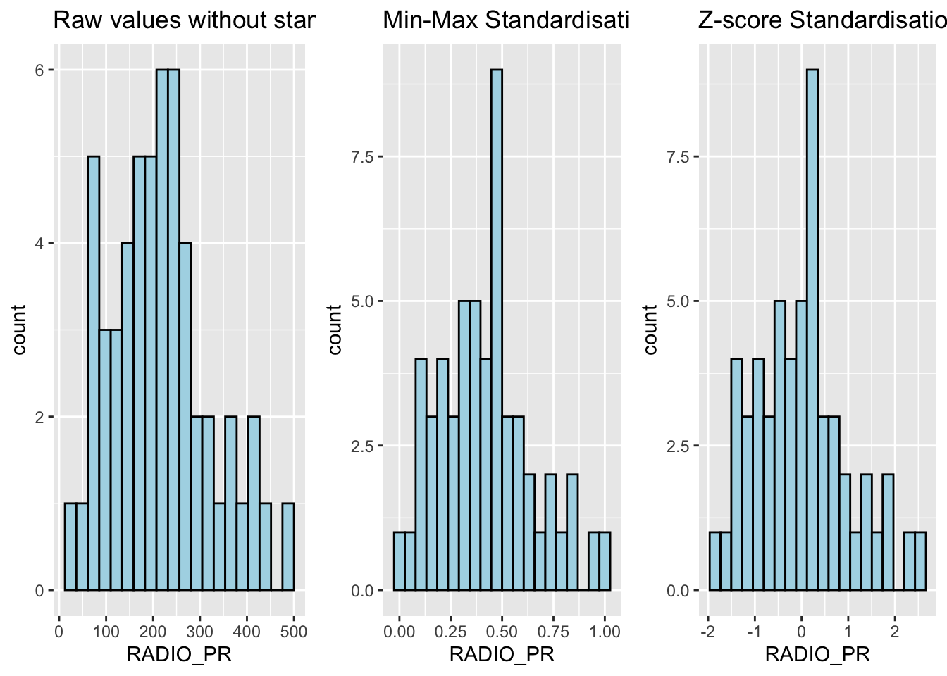
Note
What statistical conclusion can you draw from the histograms above?
The overall distribution of the clustering variables changes after the data standardisation.
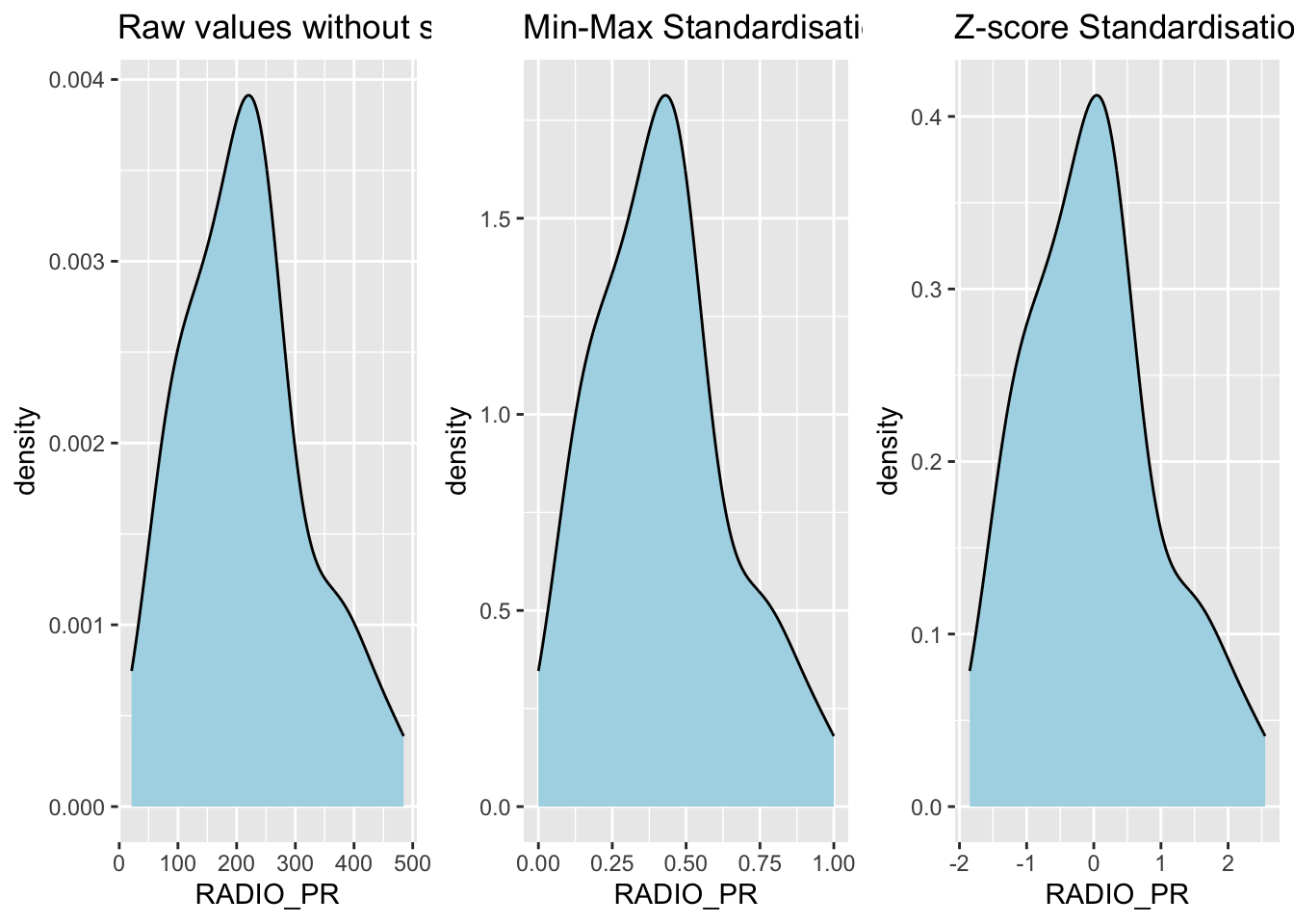
Show the code
r <- ggplot(data=ict_derived,
             aes(x= `RADIO_PR`)) +
  geom_density(color="black",
               fill="light blue") +
  ggtitle("Raw values without standardisation")

shan_ict_s_df <- as.data.frame(shan_ict.std)
s <- ggplot(data=shan_ict_s_df,
       aes(x=`RADIO_PR`)) +
  geom_density(color="black",
               fill="light blue") +
  ggtitle("Min-Max Standardisation")

shan_ict_z_df <- as.data.frame(shan_ict.z)
z <- ggplot(data=shan_ict_z_df,
       aes(x=`RADIO_PR`)) +
  geom_density(color="black",
               fill="light blue") +
  ggtitle("Z-score Standardisation")

ggarrange(r, s, z,
          ncol = 3,
          nrow = 1)
10.6 Calculating the Proximity Matrix
R offers several packages to compute distance matrices, and we
will use the
dist()
function from the base package for this purpose.
The
dist()
function supports 6 types of distance calculations: - Euclidean, -
Maximum, - Manhattan, - Canberra, - Binary, and - Minkowsk
By default, it uses the Euclidean distance.
Below is the code to compute the proximity matrix using the Euclidean method:
proxmat <- dist(shan_ict, method = 'euclidean')
To view the contents of the computed proximity matrix
(proxmat), you can use the following code:
proxmat10.7 Performing Hierarchical Clustering
In R, several packages offer hierarchical clustering functions. We
will use the
hclust()
function from the stats package.
-
Method:
hclust()uses an agglomerative approach to compute clusters. -
8 Supported Clustering Algorithms:
ward.Dward.D2singlecompleteaverage(UPGMA)mcquitty(WPGMA)median(WPGMC)centroid(UPGMC)
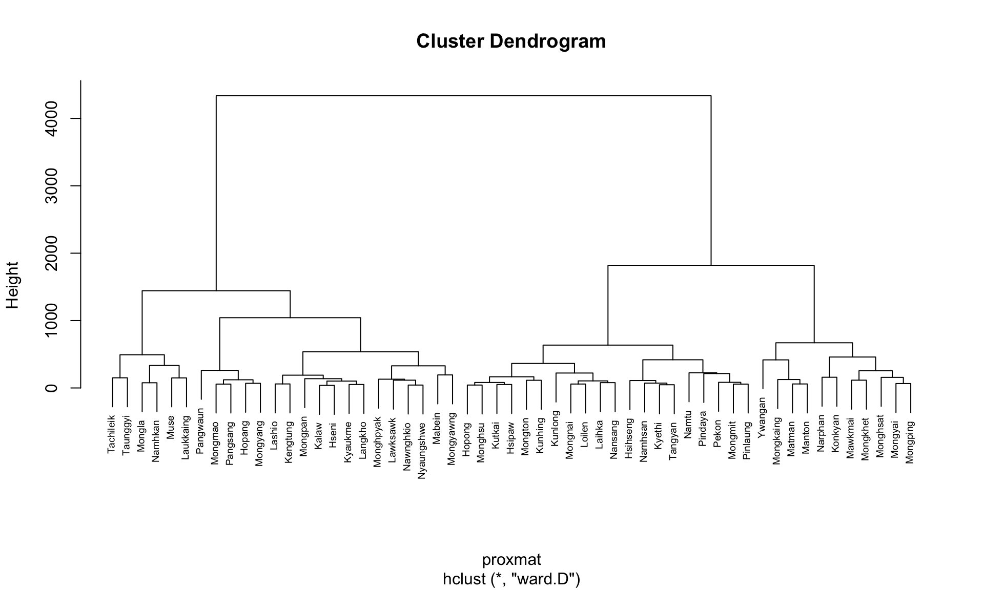
The code chunk below performs hierarchical cluster analysis using ward.D method. The hierarchical clustering output is stored in an object of class hclust which describes the tree produced by the clustering process.
hclust_ward <- hclust(proxmat, method = 'ward.D')We can then plot the tree by using plot() of R Graphics.
plot(hclust_ward, cex = 0.6)
10.8 Choosing the Optimal Clustering Algorithm
One of the challenges in hierarchical clustering is identifying
the method that provides the strongest clustering structure. This
can be addressed by using the
agnes()
function from the
cluster
package. Unlike
hclust(), the agnes() function also calculates the
agglomerative coefficient—a measure of clustering
strength (values closer to 1 indicate a stronger clustering
structure).
The code chunk below will be used to compute the agglomerative coefficients of all hierarchical clustering algorithms.
m <- c( "average", "single", "complete", "ward")
names(m) <- c( "average", "single", "complete", "ward")

ac <- function(x) {
  agnes(shan_ict, method = x)$ac
}

map_dbl(m, ac)
average single complete ward
0.8131144 0.6628705 0.8950702 0.9427730 Note
The output shows that Ward’s method has the highest agglomerative coefficient, indicating the strongest clustering structure among the methods evaluated. Therefore, Ward’s method will be used for the subsequent analysis.
10.9 Determining Optimal Clusters
Another technical challenge faced by data analysts in performing clustering analysis is to determine the optimal clusters to retain.
There are 3 commonly used methods to determine the optimal clusters, they are:
10.10 Gap Statistic Method
The gap statistic helps determine the optimal number of clusters by comparing the total within-cluster variation for different values of k against their expected values under a random reference distribution. The optimal number of clusters is identified by the value of k that maximizes the gap statistic, indicating that the clustering structure is far from random.
To compute the gap statistic, use the
clusGap()
function from the
cluster
package:
set.seed(12345)
gap_stat <- clusGap(shan_ict,
                    FUN = hcut,
                    nstart = 25,
                    K.max = 10,
                    B = 50)
# use firstmax to get the location of the first local maximum.
print(gap_stat, method = "firstmax")
Clustering Gap statistic ["clusGap"] from call:
clusGap(x = shan_ict, FUNcluster = hcut, K.max = 10, B = 50, nstart = 25)
B=50 simulated reference sets, k = 1..10; spaceH0="scaledPCA"
--> Number of clusters (method 'firstmax'): 1
logW E.logW gap SE.sim
[1,] 8.407129 8.680794 0.2736651 0.04460994
[2,] 8.130029 8.350712 0.2206824 0.03880130
[3,] 7.992265 8.202550 0.2102844 0.03362652
[4,] 7.862224 8.080655 0.2184311 0.03784781
[5,] 7.756461 7.978022 0.2215615 0.03897071
[6,] 7.665594 7.887777 0.2221833 0.03973087
[7,] 7.590919 7.806333 0.2154145 0.04054939
[8,] 7.526680 7.731619 0.2049390 0.04198644
[9,] 7.458024 7.660795 0.2027705 0.04421874
[10,] 7.377412 7.593858 0.2164465 0.04540947
The
hcut
function is from the
factoextra
package.
To visualize the gap statistic, use the
fviz_gap_stat()
function from the factoextra package:
fviz_gap_stat(gap_stat)
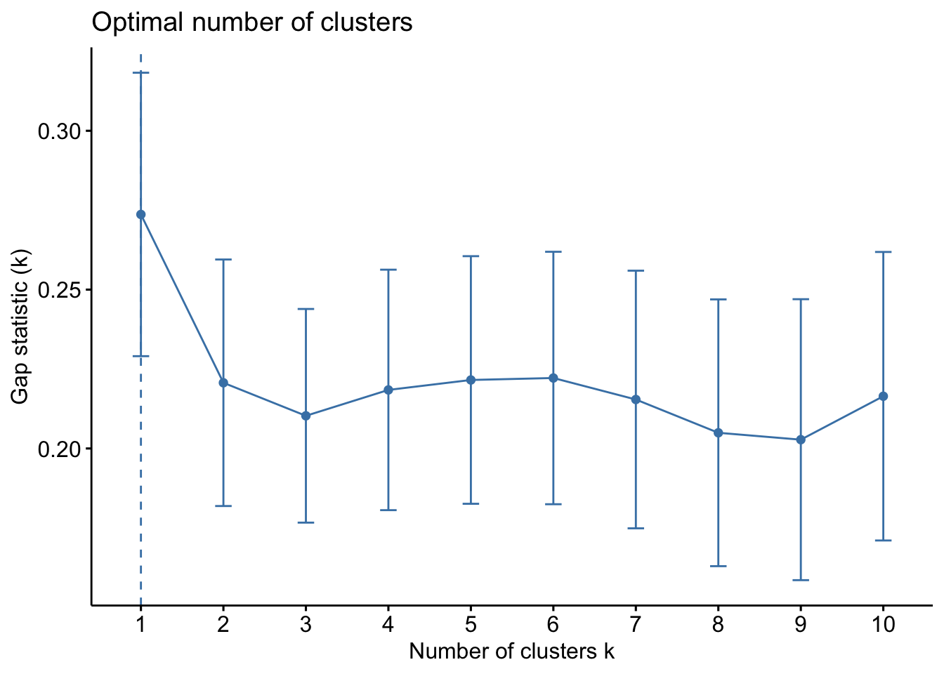
Note
From the gap statistic plot, the suggested number of clusters is 1. However, retaining only one cluster is not meaningful in most contexts. Examining the plot further, the 6-cluster solution has the largest gap statistic after 1, making it the next best choice.
Tip
Additional Note: The NbClust package offers 30 indices for determining the appropriate number of clusters. It helps users select the best clustering scheme by considering different combinations of cluster numbers, distance measures, and clustering methods (Charrad et al., 2014).
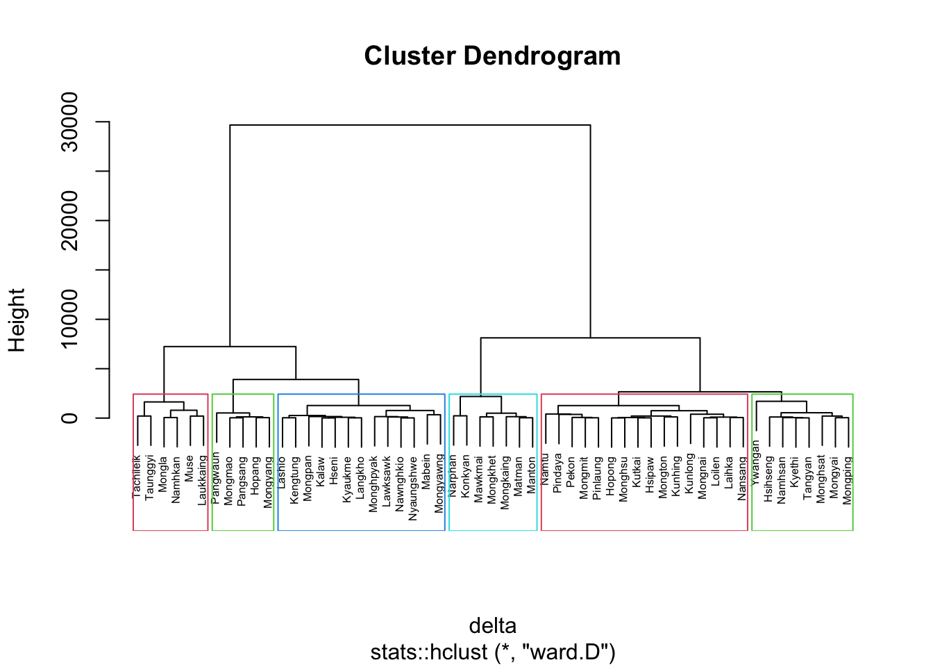
10.11 Interpreting the Dendrograms
A dendrogram visually represents the clustering of observations in hierarchical clustering:
- Leaves (Bottom of the Dendrogram): Each leaf represents a single observation.
- Branches and Fusions (Moving Up the Tree): Similar observations are grouped into branches. As we move up the tree, these branches merge at different heights.
- Height of Fusion (Vertical Axis): Indicates the level of (dis)similarity between merged observations or clusters. A greater height means the observations or clusters are less similar.
The similarity between two observations can only be assessed by the vertical height where their branches first merge. The horizontal distance between observations does not indicate their similarity.
To highlight specific clusters, use the
rect.hclust()
function to draw borders around clusters. The
border argument specifies the colors for the
rectangles.
The following code plots the dendrogram and draws borders around the 6 clusters:
plot(hclust_ward, cex = 0.6)
rect.hclust(hclust_ward,
            k = 6,
            border = 2:5)
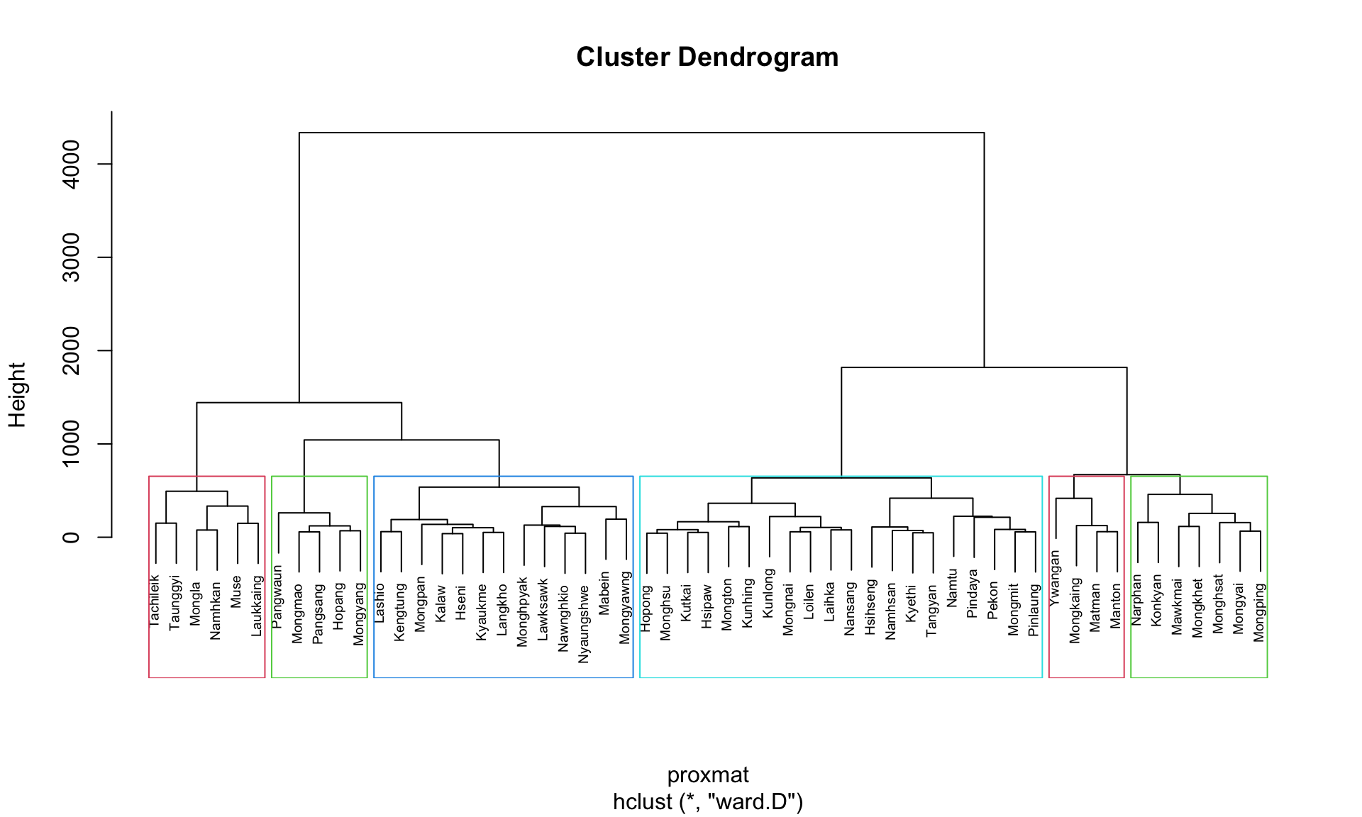
This visualization helps to easily identify and interpret the selected clusters in the dendrogram.
10.12 Visually-driven Hierarchical Clustering Analysis
With heatmaply, we are able to build both highly interactive cluster heatmap or static cluster heatmap.
10.12.1 Transforming the Data Frame into a Matrix
The data was loaded into a data frame, but it has to be a data matrix to make the heatmap.
The code below will be used to transform shan_ict data frame into a data matrix.
shan_ict_mat <- data.matrix(shan_ict)

class(shan_ict)
[1] "data.frame"class(shan_ict_mat)[1] "matrix" "array" 10.12.2 Plotting Interactive Cluster Heatmap using heatmaply()
In the code below, the heatmaply() of heatmaply package is used to build an interactive cluster heatmap.
heatmaply(normalize(shan_ict_mat),
          Colv=NA,
          dist_method = "euclidean",
          hclust_method = "ward.D",
          seriate = "OLO",
          colors = Blues,
          k_row = 6,
          margins = c(NA,200,60,NA),
          fontsize_row = 4,
          fontsize_col = 5,
          main="Geographic Segmentation of Shan State by ICT indicators",
          xlab = "ICT Indicators",
          ylab = "Townships of Shan State"
          )
10.13 Mapping the Clusters Formed
Upon close examination of the dendrogram above, we have decided to retain 6 clusters.
- use cutree() of R Base to derive a 6-cluster model
The output is called groups. It is a factor object.
In order to visualise the clusters, the groups object need to be appended onto shan_sf simple feature object.
The code below form the join in three steps:
- the groups list object will be converted into a matrix;
-
cbind() is used to append groups matrix onto
shan_sf to produce an output simple feature object called
shan_sf_cluster; and - rename of dplyr package is used to rename as.matrix.groups field as CLUSTER.
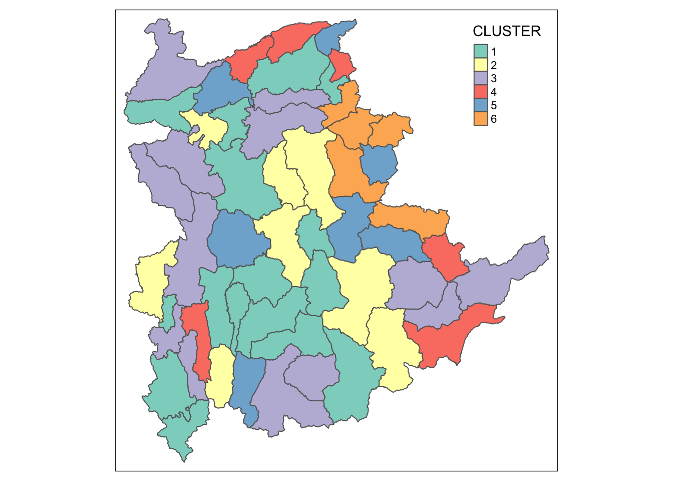
Next, qtm() of tmap package is used to plot the choropleth map showing the cluster formed.
qtm(shan_sf_cluster, "CLUSTER")
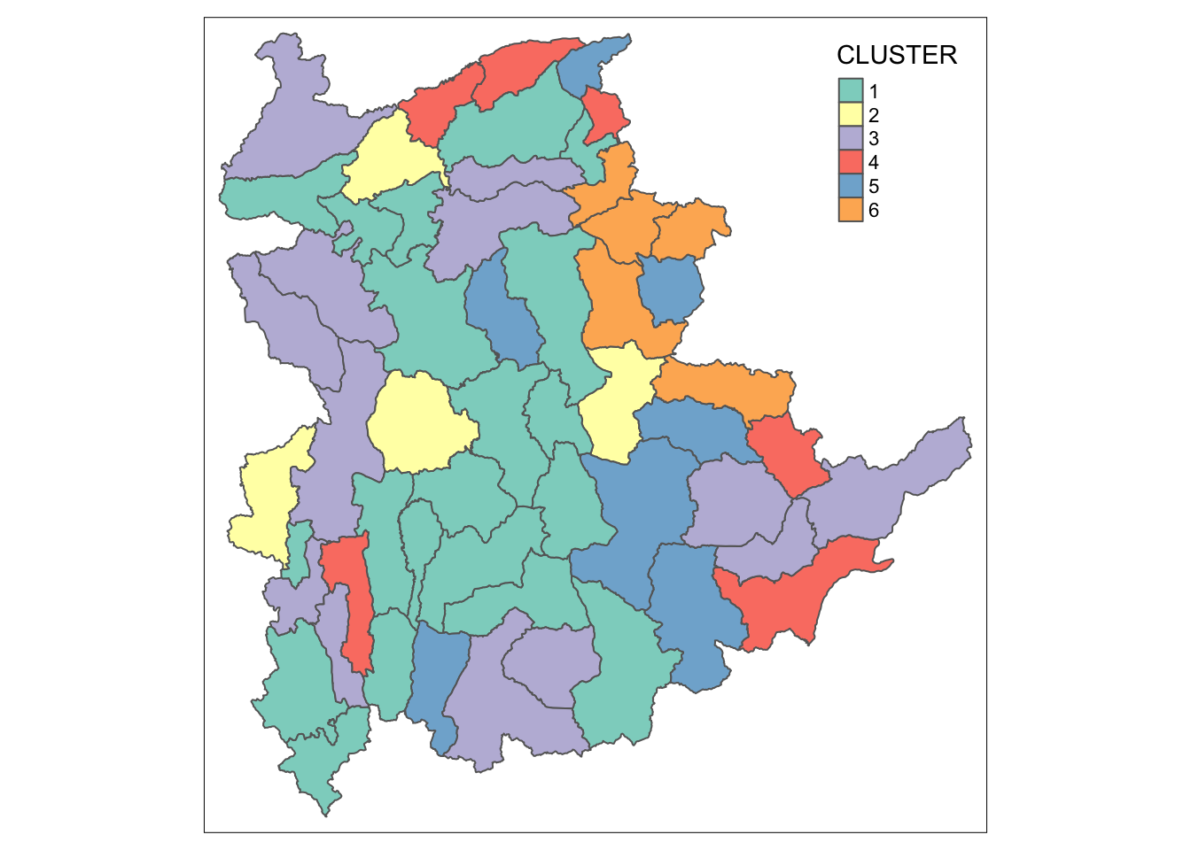
Note
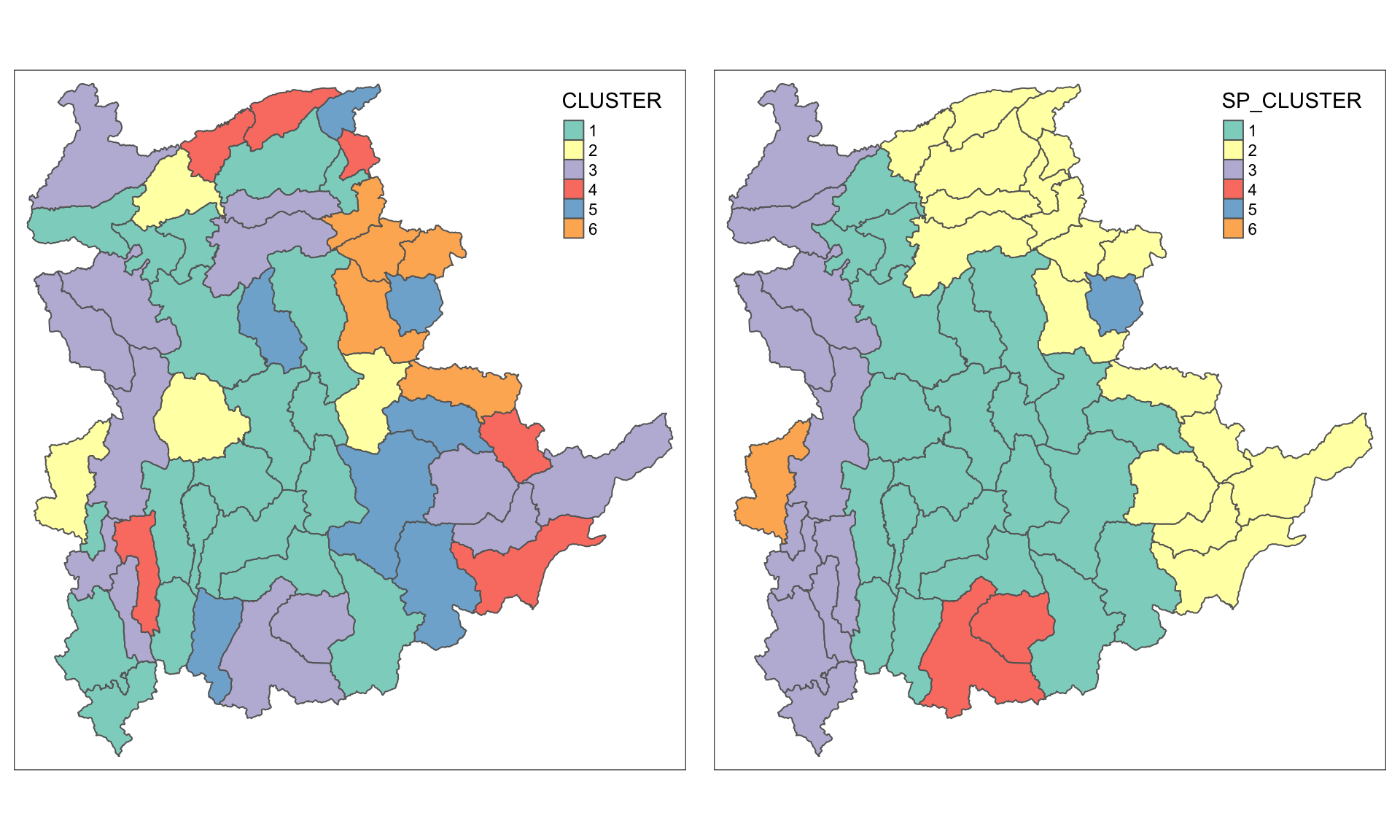
The choropleth map above reveals the clusters are very fragmented. The is one of the major limitation when non-spatial clustering algorithm such as hierarchical cluster analysis method is used.
11 Spatially Constrained Clustering: SKATER approach
In this section, we will derive spatially constrained cluster by using skater() method of spdep package.
11.1 Converting into SpatialPolygonsDataFrame
First, we need to convert shan_sf into
SpatialPolygonsDataFrame. This is because SKATER function only
support sp objects such as
SpatialPolygonDataFrame.
The code below uses as_Spatial() of sf package to convert shan_sf into a SpatialPolygonDataFrame called shan_sp.
shan_sp <- as_Spatial(shan_sf)11.2 Computing Neighbour List
To compute the list of neighboring polygons, use the
poly2nb()
function from the spdep package.
shan.nb <- poly2nb(shan_sp)
summary(shan.nb)
Neighbour list object:
Number of regions: 55
Number of nonzero links: 264
Percentage nonzero weights: 8.727273
Average number of links: 4.8
Link number distribution:
2 3 4 5 6 7 8 9
5 9 7 21 4 3 5 1
5 least connected regions:
3 5 7 9 47 with 2 links
1 most connected region:
8 with 9 linksTo visualize the neighbors on the map, you can plot the community area boundaries and the neighbor network together. Here’s how:
-
Plot the Boundaries: Use the
plot()function to draw the boundaries of the spatial polygons (shan_sf). -
Compute Centroids: Extract the centroids of the
polygons using the
st_centroid()function, which will serve as the nodes for the neighbor network.
coords <- st_coordinates(
st_centroid(st_geometry(shan_sf)))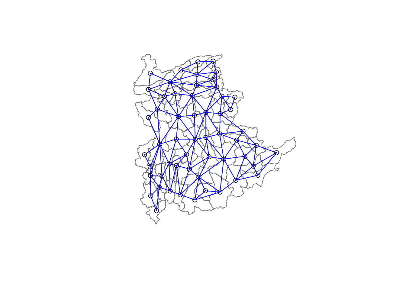
Tip
Plot Order Matters: Always plot the boundaries first, followed by the network. If the network is plotted first, some areas may be clipped because the plotting area is determined by the first plot’s extent. Plotting the boundaries first ensures the entire map area is visible.
11.3 Calculating Edge Costs
Next, nbcosts() of spdep package is used to compute the cost of each edge. It is the distance between it nodes. This function compute this distance using a data.frame with observations vector in each node.
The code below is used to compute the cost of each edge.
lcosts <- nbcosts(shan.nb, shan_ict)For each observation, this gives the pairwise dissimilarity between its values on the five variables and the values for the neighbouring observation (from the neighbour list). Basically, this is the notion of a generalised weight for a spatial weights matrix.
Next, we will incorporate these costs into a weights object in the same way as we did in the calculation of inverse of distance weights. In other words, we convert the neighbour list to a list weights object by specifying the just computed lcosts as the weights.
In order to achieve this, nb2listw() of spdep package is used as shown in the code chunk below.
Note that we specify the style as B to make sure the cost values are not row-standardised.
shan.w <- nb2listw(shan.nb,
lcosts,
style="B")
summary(shan.w)Characteristics of weights list object:
Neighbour list object:
Number of regions: 55
Number of nonzero links: 264
Percentage nonzero weights: 8.727273
Average number of links: 4.8
Link number distribution:

 2  3  4  5  6  7  8  9
 5  9  7 21  4  3  5  1
5 least connected regions:
3 5 7 9 47 with 2 links
1 most connected region:
8 with 9 links
Weights style: B
Weights constants summary:
n nn S0 S1 S2
B 55 3025 76267.65 58260785 52201600411.4 Computing Minimum Spanning Tree
The minimum spanning tree is computed by mean of the mstree() of spdep package as shown in the code chunk below.
shan.mst <- mstree(shan.w)After computing the MST, we can check its class and dimension by using the code below.
Note
The dimension is 54 and not 55.
This is because the minimum spanning tree consists on n-1 edges (links) in order to traverse all the nodes.
We can display the content of shan.mst by using head() as shown in the code below.
head(shan.mst) [,1] [,2] [,3]
[1,] 54 48 47.79331
[2,] 54 17 109.08506
[3,] 54 45 127.42203
[4,] 45 52 146.78891
[5,] 52 13 110.55197
[6,] 13 28 92.79567The plot method for the MST include a way to show the observation numbers of the nodes in addition to the edge. As before, we plot this together with the township boundaries. We can see how the initial neighbour list is simplified to just one edge connecting each of the nodes, while passing through all the nodes.
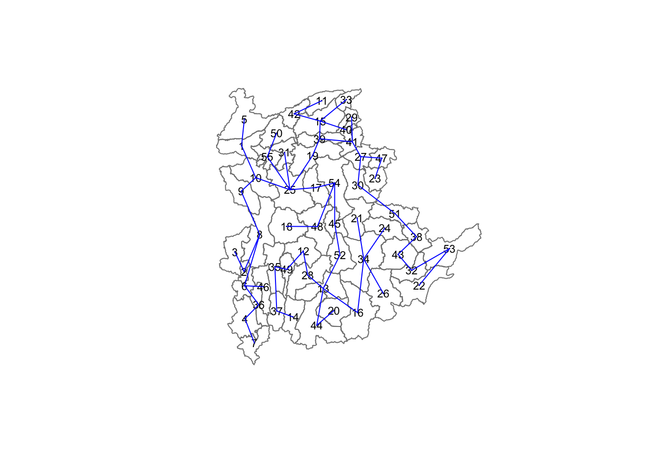
11.5 Computing Spatially Constrained Clusters using SKATER Method
The code below compute the spatially constrained cluster using skater() of spdep package.
clust6 <- spdep::skater(edges = shan.mst[,1:2],
                 data = shan_ict,
                 method = "euclidean",
                 ncuts = 5)
The skater() function requires three mandatory
arguments:
- First two columns of the MST matrix: These columns represent the edges of the Minimum Spanning Tree (MST) without the cost.
- Data matrix: This is used to update the costs dynamically as units are grouped together.
- Number of cuts: This is set to one less than the desired number of clusters. Remember, this value represents the number of cuts in the graph, not the total number of clusters.
The output of skater() is an object of class
skater. You can examine its contents using the
following code:
str(clust6)List of 8
$ groups : num [1:55] 3 3 6 3 3 3 3 3 3 3 ...
$ edges.groups:List of 6
..$ :List of 3
.. ..$ node: num [1:22] 13 48 54 55 45 37 34 16 25 52 ...
.. ..$ edge: num [1:21, 1:3] 48 55 54 37 34 16 45 25 13 13 ...
.. ..$ ssw : num 3423
..$ :List of 3
.. ..$ node: num [1:18] 47 27 53 38 42 15 41 51 43 32 ...
.. ..$ edge: num [1:17, 1:3] 53 15 42 38 41 51 15 27 15 43 ...
.. ..$ ssw : num 3759
..$ :List of 3
.. ..$ node: num [1:11] 2 6 8 1 36 4 10 9 46 5 ...
.. ..$ edge: num [1:10, 1:3] 6 1 8 36 4 6 8 10 10 9 ...
.. ..$ ssw : num 1458
..$ :List of 3
.. ..$ node: num [1:2] 44 20
.. ..$ edge: num [1, 1:3] 44 20 95
.. ..$ ssw : num 95
..$ :List of 3
.. ..$ node: num 23
.. ..$ edge: num[0 , 1:3]
.. ..$ ssw : num 0
..$ :List of 3
.. ..$ node: num 3
.. ..$ edge: num[0 , 1:3]
.. ..$ ssw : num 0
$ not.prune : NULL
$ candidates : int [1:6] 1 2 3 4 5 6
$ ssto : num 12613
$ ssw : num [1:6] 12613 10977 9962 9540 9123 ...
$ crit : num [1:2] 1 Inf
$ vec.crit : num [1:55] 1 1 1 1 1 1 1 1 1 1 ...
- attr(*, "class")= chr "skater"The most interesting component of this list structure is the groups vector containing the labels of the cluster to which each observation belongs (as before, the label itself is arbitary). This is followed by a detailed summary for each of the clusters in the edges.groups list. Sum of squares measures are given as ssto for the total and ssw to show the effect of each of the cuts on the overall criterion.
We can check the cluster assignment by using the code:
ccs6 <- clust6$groups
ccs6
[1] 3 3 6 3 3 3 3 3 3 3 2 1 1 1 2 1 1 1 2 4 1 2 5 1 1 1 2 1 2 2 1 2 2 1 1 3 1 2
[39] 2 2 2 2 2 4 1 3 2 1 1 1 2 1 2 1 1We can find out how many observations are in each cluster by means of the table command.
Parenthetially, we can also find this as the dimension of each vector in the lists contained in edges.groups. For example, the first list has node with dimension 12, which is also the number of observations in the first cluster.
table(ccs6)ccs6
1 2 3 4 5 6
22 18 11 2 1 1 Lastly, we can also plot the pruned tree that shows the five clusters on top of the townshop area.
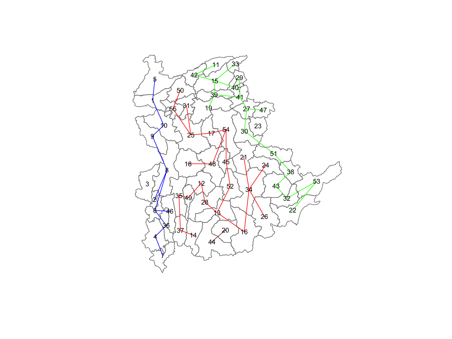
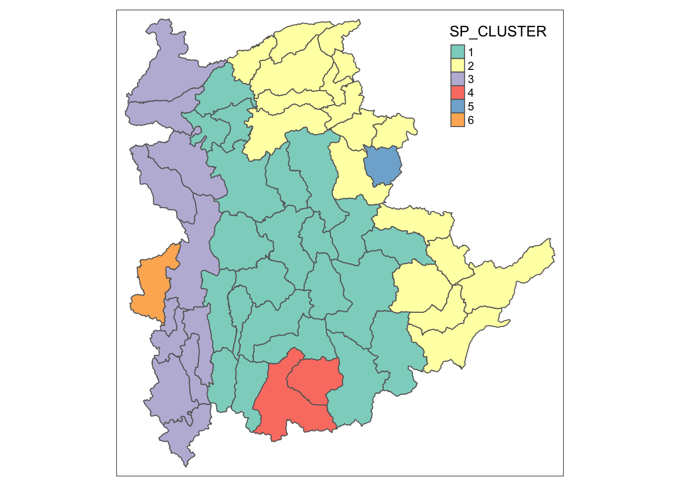
11.6 Visualising the Clusters in Choropleth Map
The code below is used to plot the newly derived clusters by using SKATER method.
groups_mat <- as.matrix(clust6$groups)
shan_sf_spatialcluster <- cbind(shan_sf_cluster, as.factor(groups_mat)) %>%
  rename(`SP_CLUSTER`=`as.factor.groups_mat.`)
qtm(shan_sf_spatialcluster, "SP_CLUSTER")
For easy comparison, it will be better to place both the hierarchical clustering and spatially constrained hierarchical clustering maps next to each other.
hclust.map <- qtm(shan_sf_cluster,
                  "CLUSTER") +
  tm_borders(alpha = 0.5)

shclust.map <- qtm(shan_sf_spatialcluster,
                   "SP_CLUSTER") +
  tm_borders(alpha = 0.5)

tmap_arrange(hclust.map, shclust.map,
             asp=NA, ncol=2)
12 Spatially Constrained Clustering: ClustGeo Method
In this section, we will perform both non-spatially constrained and spatially constrained hierarchical cluster analysis with the ClustGeo package.
12.1 Overview of the ClustGeo Package
The
ClustGeo
package in R is designed specifically for spatially constrained
cluster analysis. It offers a Ward-like hierarchical clustering
algorithm called hclustgeo(), which incorporates
spatial or geographical constraints:
-
Dissimilarity Matrices (D0 and D1):
- D0: Represents dissimilarities in the attribute/clustering variable space. It can be non-Euclidean, and the weights of the observations can be non-uniform.
- D1: Represents dissimilarities in the constraint space (e.g., spatial/geographical constraints).
-
Mixing Parameter (alpha):
-
A value between [0, 1] that balances the importance of the
attribute dissimilarity (D0) and the spatial constraint
dissimilarity (D1). The objective is to find an alpha value
that enhances spatial continuity without significantly
compromising the quality of clustering based on the
attributes of interest. This can be achieved using the
choicealpha()function.
-
A value between [0, 1] that balances the importance of the
attribute dissimilarity (D0) and the spatial constraint
dissimilarity (D1). The objective is to find an alpha value
that enhances spatial continuity without significantly
compromising the quality of clustering based on the
attributes of interest. This can be achieved using the
12.2 Ward-like Hierarchical Clustering with ClustGeo
The hclustgeo() function from the ClustGeo package
performs a Ward-like hierarchical clustering, similar to the
hclust()
function.
To perform non-spatially constrained hierarchical clustering, provide the function with a dissimilarity matrix, as demonstrated in the code example below:
nongeo_cluster <- hclustgeo(proxmat)
plot(nongeo_cluster, cex = 0.5)
rect.hclust(nongeo_cluster,
            k = 6,
            border = 2:5)
Tip
The dissimilarity matrix must be an object of class
dist, i.e. an object obtained with the
function
dist().
12.2.1 Mapping Clusters
We can plot the clusters on a categorical area shaded map.
qtm(shan_sf_ngeo_cluster, "CLUSTER")
12.3 Spatially Constrained Hierarchical Clustering
Before we can performed spatially constrained hierarchical
clustering, a spatial distance matrix will be derived by using
st_distance()
of sf package.
as.dist()
is needed to convert the data frame into matrix.
Next, choicealpha() will be used to determine a
suitable value for the mixing parameter alpha.
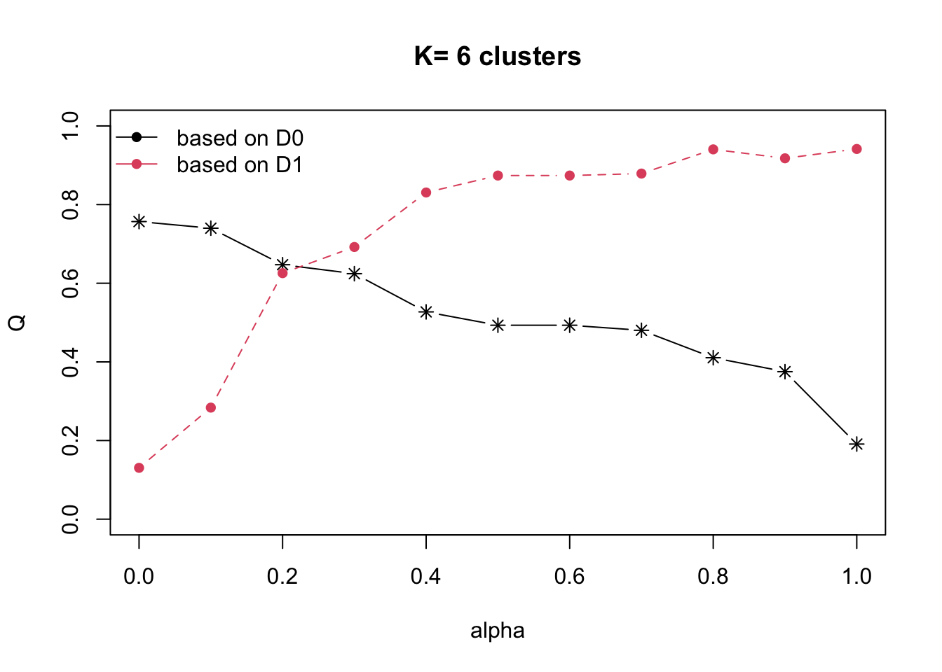
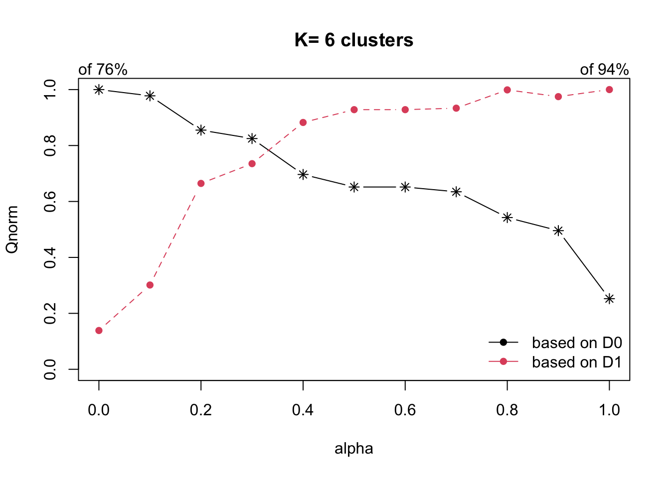
With reference to the graphs above, alpha = 0.3 will be used since it is the intersection point between D0 and D1.
clustG <- hclustgeo(proxmat, distmat, alpha = 0.3)
Next,
cutree()
is used to derive the cluster objecct.
We will then join back the group list with shan_sf polygon feature data frame by using the code below.
We can now plot the map of the newly delineated spatially constrained clusters.
qtm(shan_sf_Gcluster, "CLUSTER")
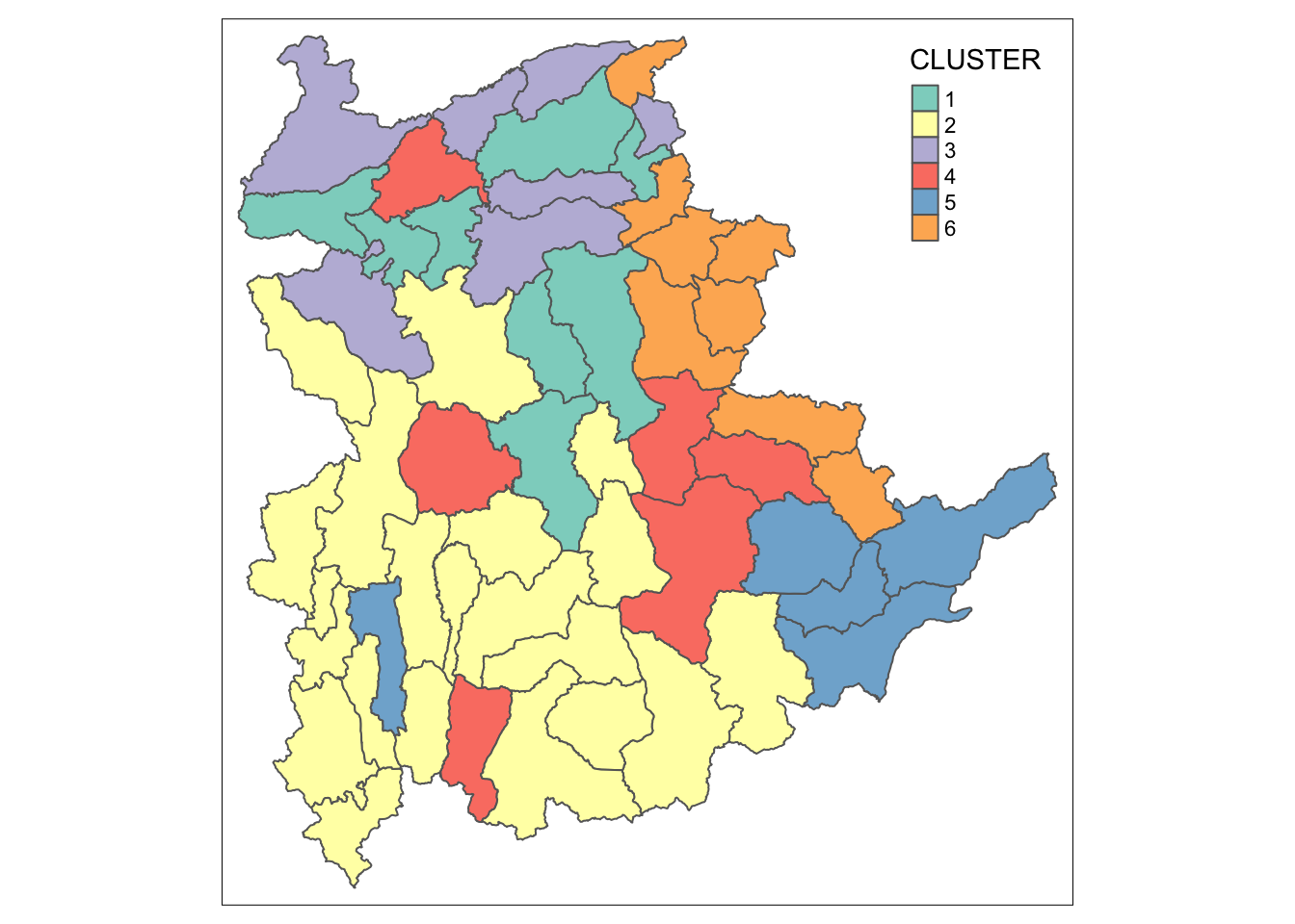
13 Visual Interpretation of Clusters
13.1 Visualising individual clustering variable
To reveal the distribution of a clustering variable (i.e RADIO_PR) by cluster.
ggplot(data = shan_sf_ngeo_cluster,
       aes(x = CLUSTER, y = RADIO_PR)) +
  geom_boxplot()
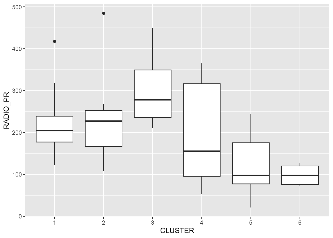
Note
The boxplot reveals Cluster 3 displays the highest mean Radio Ownership Per Thousand Household. This is followed by Cluster 2, 1, 4, 6 and 5.
13.2 Multivariate Visualisation
Parallel coordinate plot can be used to reveal clustering variables by cluster very effectively.
ggparcoord() of **GGally* package is used in the code
below.
ggparcoord(data = shan_sf_ngeo_cluster,
           columns = c(17:21),
           scale = "globalminmax",
           alphaLines = 0.2,
           boxplot = TRUE,
           title = "Multiple Parallel Coordinates Plots of ICT Variables by Cluster") +
  facet_grid(~ CLUSTER) +
  theme(axis.text.x = element_text(angle = 30))
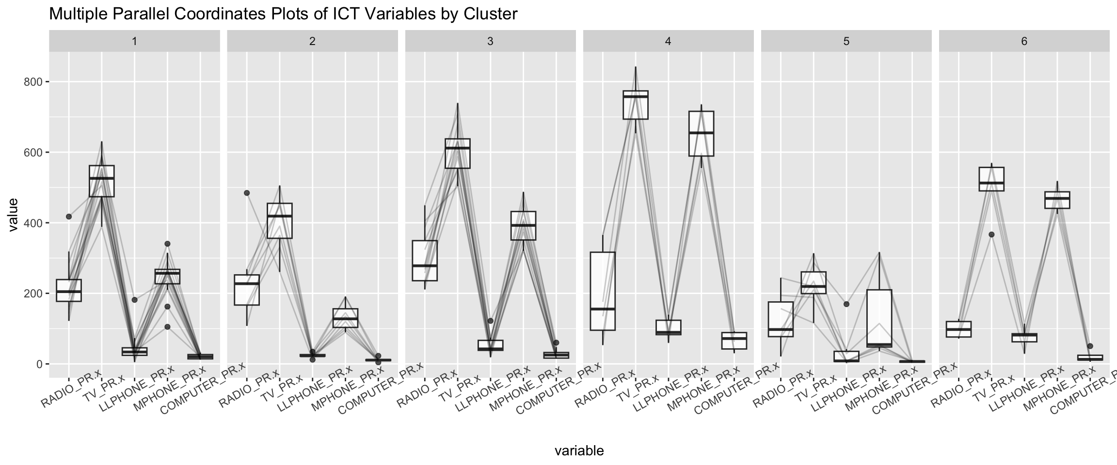
Note
Observation
-
The parallel coordinate plot above reveals that households in Cluster 4 townships tend to own the highest number of TV and mobile-phone.
-
On the other hand, households in Cluster 5 tends to own the lowest of all the five ICT.
Note
The scale argument of ggparcoor() provide several
methods to scale the clustering variables. They are:
- std: univariately, subtract mean and divide by standard deviation.
- robust: univariately, subtract median and divide by median absolute deviation.
- uniminmax: univariately, scale so the minimum of the variable is zero, and the maximum is one.
- globalminmax: no scaling is done; the range of the graphs is defined by the global minimum and the global maximum.
- center: use uniminmax to standardize vertical height, then center each variable at a value specified by the scaleSummary param.
- centerObs: use uniminmax to standardize vertical height, then center each variable at the value of the observation specified by the centerObsID param
The suitability of scale argument is dependent on your use case.
To complement the visual interpretation, use
group_by() and summarise() of dplyr are
used to derive mean values of the clustering variables:
shan_sf_ngeo_cluster %>%
  st_set_geometry(NULL) %>%
  group_by(CLUSTER) %>%
  summarise(mean_RADIO_PR = mean(RADIO_PR),
            mean_TV_PR = mean(TV_PR),
            mean_LLPHONE_PR = mean(LLPHONE_PR),
            mean_MPHONE_PR = mean(MPHONE_PR),
            mean_COMPUTER_PR = mean(COMPUTER_PR))
# A tibble: 6 × 6
CLUSTER mean_RADIO_PR mean_TV_PR mean_LLPHONE_PR mean_MPHONE_PR
<chr> <dbl> <dbl> <dbl> <dbl>
1 1 221. 521. 44.2 246.
2 2 237. 402. 23.9 134.
3 3 300. 611. 52.2 392.
4 4 196. 744. 99.0 651.
5 5 124. 224. 38.0 132.
6 6 98.6 499. 74.5 468.
# ℹ 1 more variable: mean_COMPUTER_PR <dbl>